
New York Transit Musuem
Redesigning the Website's UI & Information Architecture for Seamless User Navigation
42%
Higher engagement
18%
Higher user conversion
22%
Reduction in Drop-off rate
Who is client (New York Transit Museum)?
The Museum Showcasing New York City's Transit Evolution
The New York Transit Museum currently located in Brooklyn showcases the history of New York City's subway, bus, and commuter rail systems. It features an extensive collection of trains and buses that highlight the evolution of the city's transit network.
This self-supporting museum operates with the assistance of a nonprofit organization, Friends of the New York Transit Museum.
The Problem : What issues led to Redesign of website ?
Jargon and Disorganized Navigation Hindering User Experience
Unclear Hierarchy
Multiple paths to access the same pages or information, indicating unclear hierarchy and classification.
Redundant labels
Redundant labels in the level 2 navigation.
Difficult Navigation
Misleading or context-specific label descriptions, making them difficult for users to navigate.
Website before Redesign
The Solution
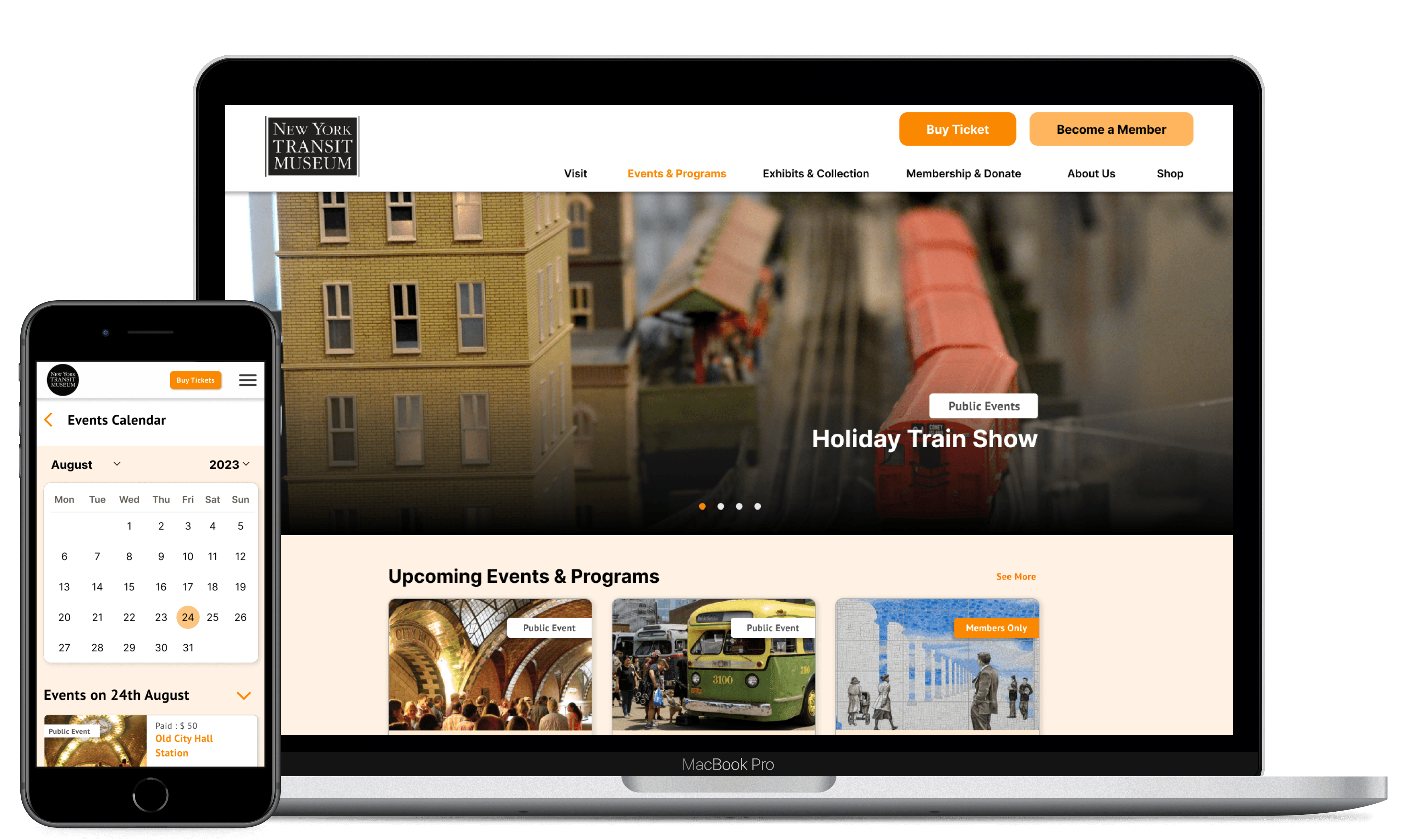
Restructuring the information architecture to emphasize trip planning and highlight upcoming events and programs
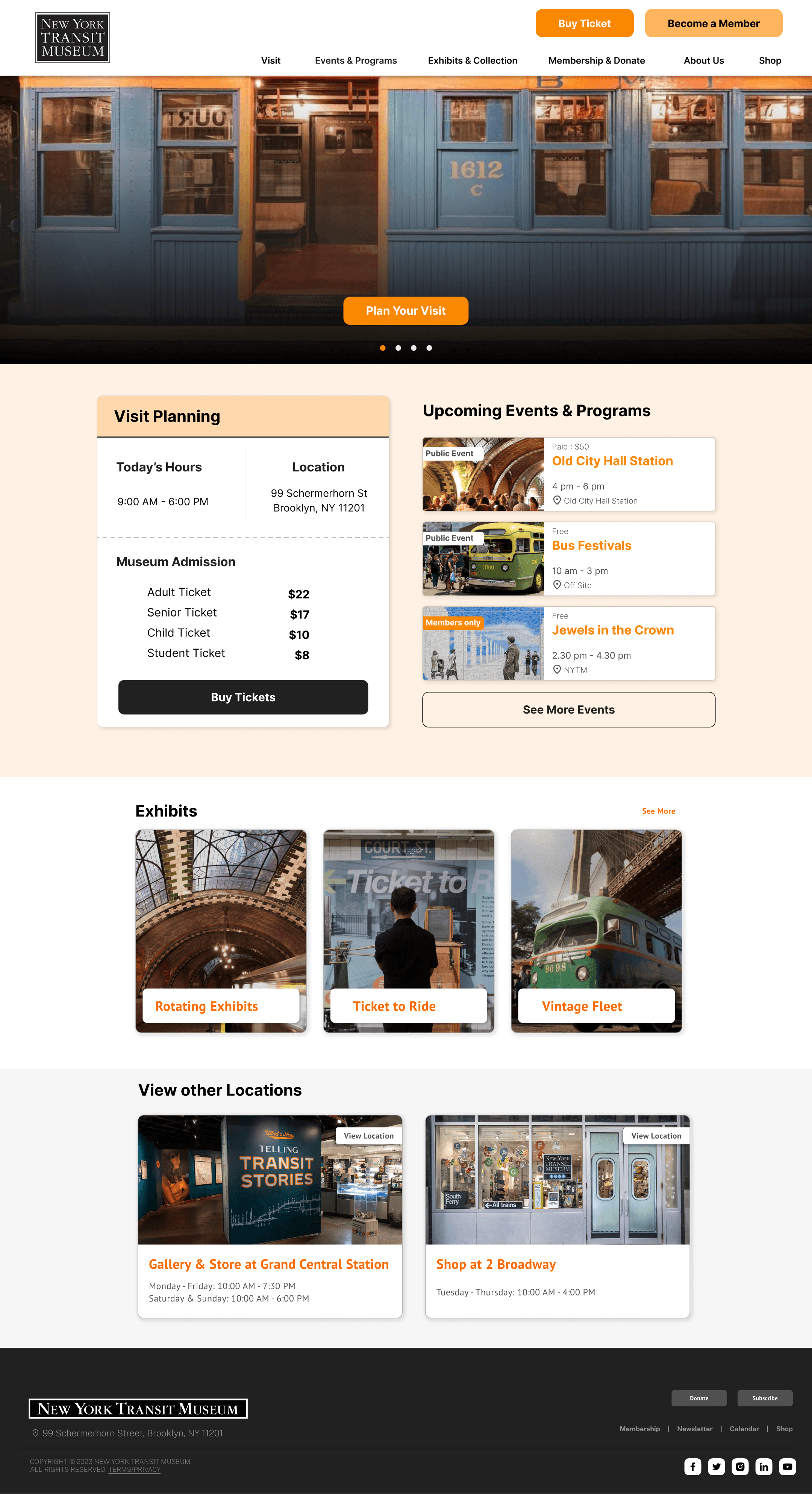
Creating a structured hierarchy with key touchpoints across the homepage
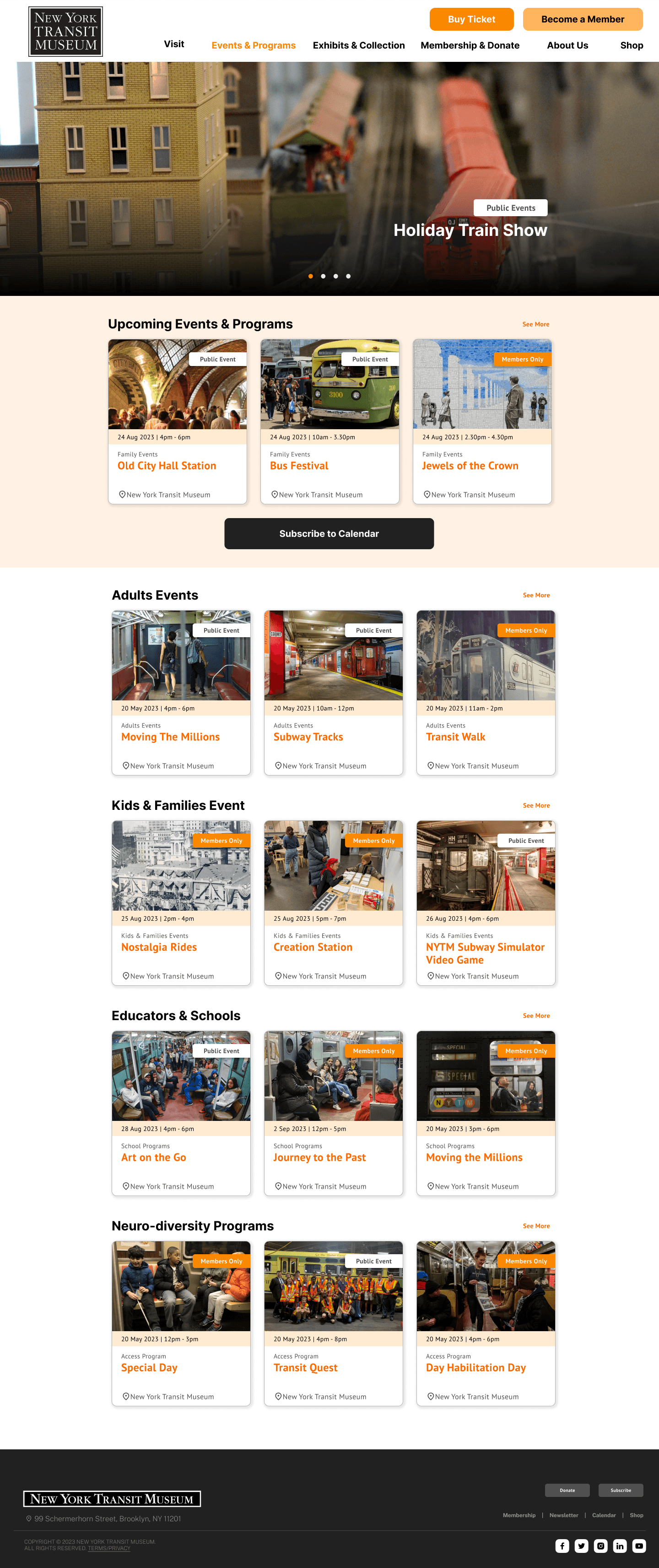
Building the homepage with a hero image scroll bar to showcase visit details with multiple museum locations, a brief summary of upcoming events and programs, and a link to the full events page.
Featuring exhibit information with links to detailed pages.
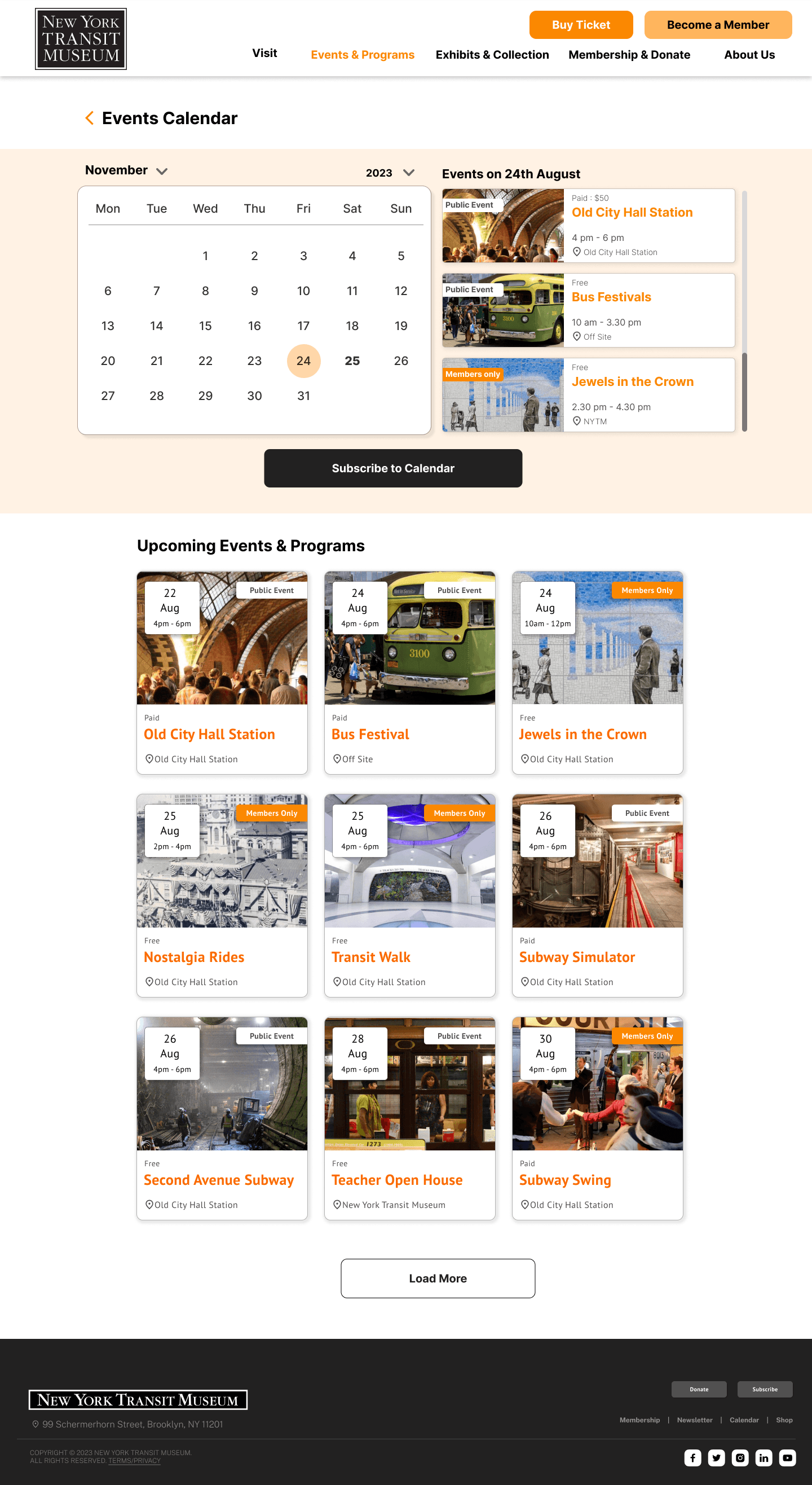
Developing a calendar for upcoming events, categorized for easy access
Developing a dedicated events page with a calendar for easy access to upcoming events.

Our Approach : How did we accomplish this?
Research & Redesign Process
Gaining User Insights
Screener Survey
User Interviews
Affinity Mapping
Creating Persona.
Restructuring Information Architecture
Card Sorting
Tree Testing
Competitive Analysis
Revamping the Website
Ideation Sketches
Usability Testing
Final Prototype
How we developed an understanding of the user?
We implemented screeners, user interviews, and affinity mapping to gather insights
Screener Survey
Targeted individuals in their early to late 20s.
Focused on students and working professionals with an interest in museums.
View Screener Survey & Interview Script
User Interview
Interviewed 8 users to understand their expectations, motivations, & preferred devices for accessing the museum website.
Recorded and transcribed both in-person & remote interviews for analysis.
View Interview Transcript
Affinity Mapping
Used affinity mapping to organize & analyze interview data.
Revealed users' interest in visit planning and program events.
What were our user interview insights?
Key User Insight
8/8
Participants mentioned need of clear pricing and discount details, along with a quick, hassle-free ticket booking process.
7/8
Participants want to know about the most popular or interesting exhibit & Event so they can prioritize their time and ensure they don’t miss it.
5/8
Participants prefer a single website for museum information and need clear details on open hours to plan their visit.
How these insights helped us design with a stronger user focus?
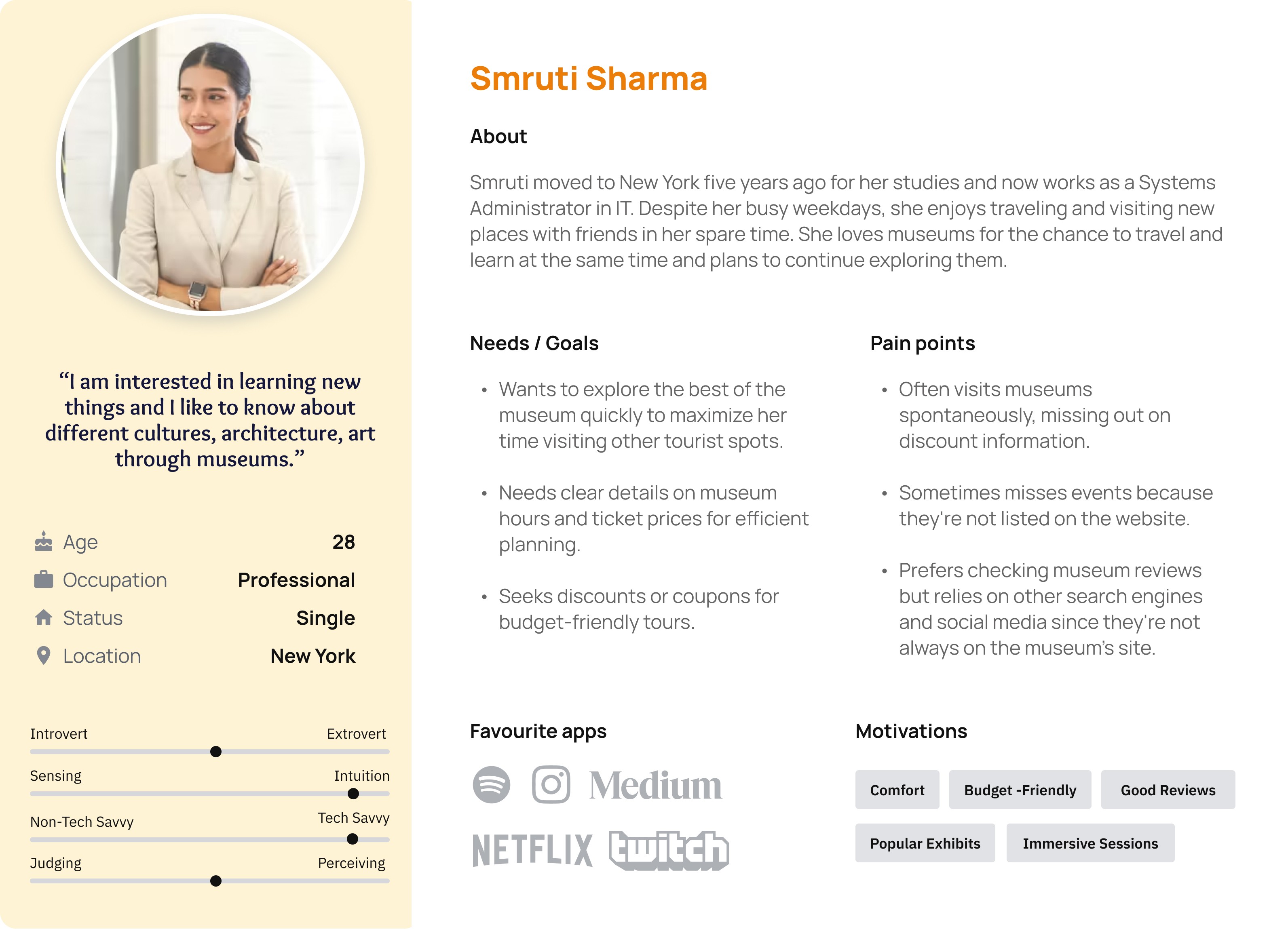
We developed a persona based on our user insights
How we began restructuring the information architecture?
Through card sorting users created 3 major groups: Events, History & Visit Planning
11 Users participated on our card sorting study - 4 moderated & 7 unmoderated
Users spent an average of 18m to perform card sorting.
Users created a median of 5 categories each.
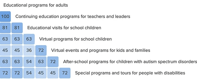
Users strongly grouped Education, Event & Program related labels together.
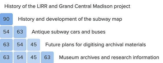
Users overall strongly grouped information related to history, research, and archives together
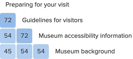
Users moderately grouped Visit related information & museum background together
Our overarching goals were to:
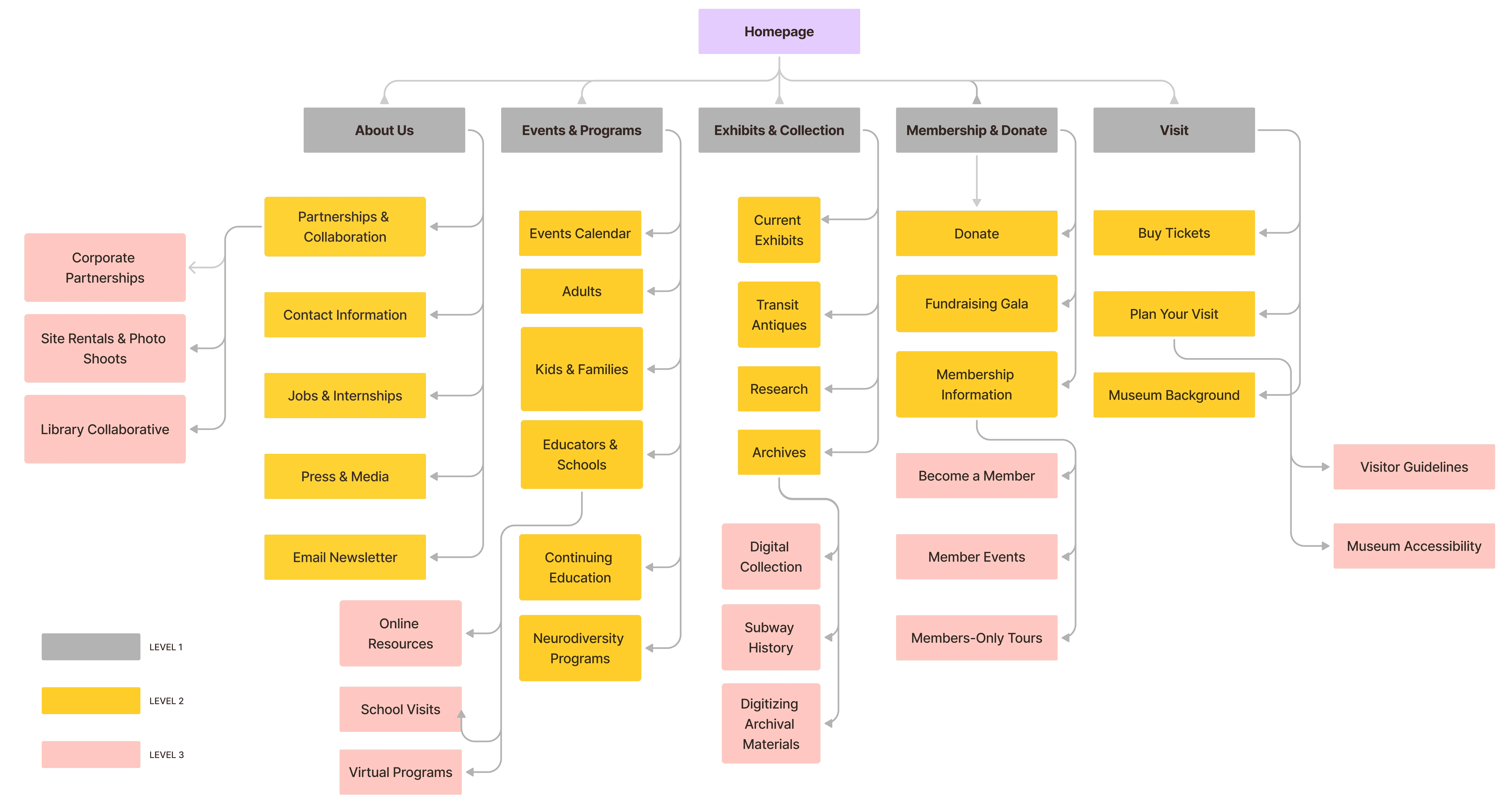
Restrict the number of Level 1 categories to a maximum of six to simplify initial navigation for users
Ensure that the navigation does not extend beyond three levels to minimize the number of clicks needed for users to reach their destination.
How we determined the navigation structure?
We employed tree testing to ensure the navigation aligns with user preferences
After developing this initial information architecture, we tested our proposed labeling & organization through tree testing.
The tree testing achieved an overall success rate of 62%, with a directness rate of 68%. Both metrics are above 60%, indicating that our information architecture is generally performing well.
100 %
Participants were able to find
Buy Tickets
80 %
Participants were able to find
Museum Accessibiltiy
70 %
Participants were able to find
Become a Member
60 %
Participants were able to find
Donate
How we applied insights from our card sorting and tree testing?
Restructured Information Architecture
Competitive Analysis : what we learned from our competitors?
Visual hierarchy, organized layout & straightforward navigation are key essentials for an effective museum website
Our analysis shows that the most successful museum and specialty attraction website's feature:
Well-balanced white space
Careful use of color
A strong visual hierarchy that guides the user’s eye down the page
Clear and distinct navigation labels
Prominently placed, targeted call-to-action buttons
A streamlined and efficient ticket purchasing process
Revamping the website
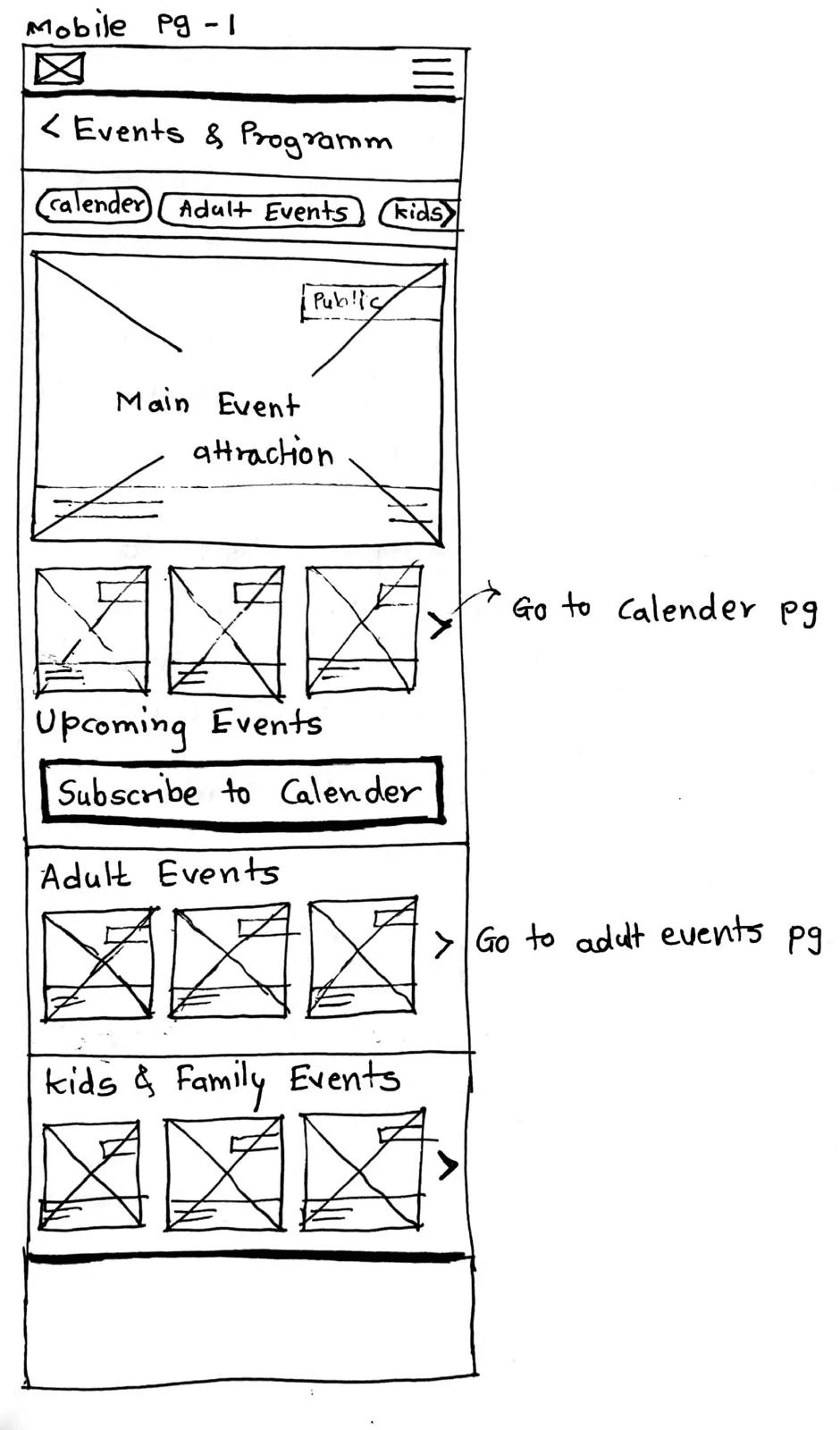
Ideation
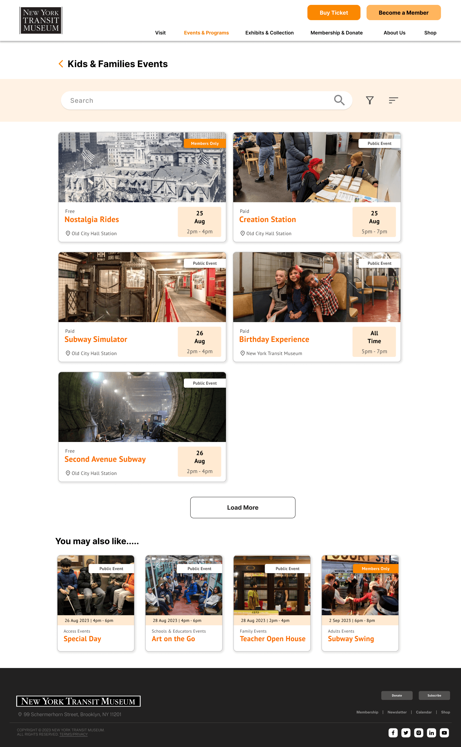
Finding Upcoming Events Flow
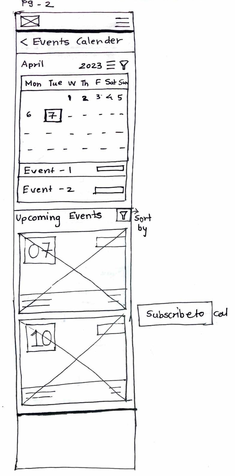
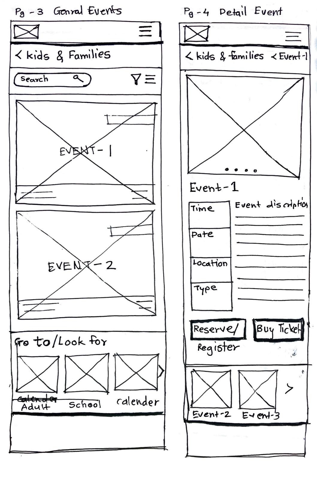
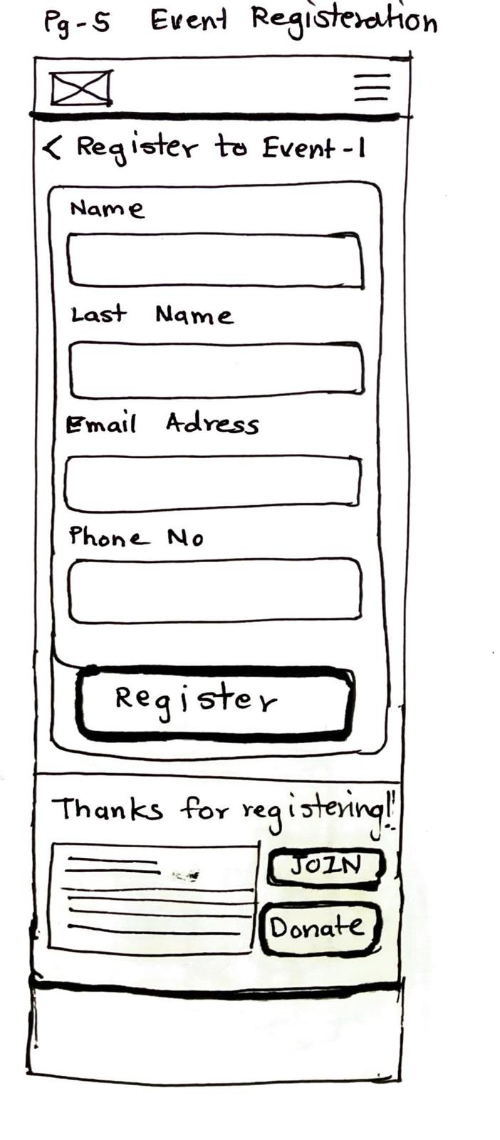
Final Prototype
Event Registration Task Flow Wireframes



Reflections
I developed a strong understanding of how to approach and manage content-heavy websites
Key Success
Targeting certain sections of the website, backed by user research, was more advantageous than addressing the entire site at once.
Future Direction
With more time, we would have focused on enhancing the flow of new exhibits and collections, as highlighted in user insights.
Scope for Improvement
We learned that being aware of client resources is vital before advising on design changes.